3 QUICK FIXES FOR YOUR WEBSITE | GUEST BLOGGER: RAISE YOUR WORDS BRANDING & DESIGN

Hi everyone! My name is Elisabeth Stuckey, and I am a story-based brand designer. I help business owners develop a deep sense of their identity as a brand, so they can connect to their audience on a more meaningful level. I also design logos, branding materials and websites!
Today, I am taking over Amanda’s blog to share some tips & tricks for improving your website!
With life on halt during the quarantine, it’s the perfect time to invest in your business and fine tune things behind the scenes. Your website is arguably the most influential factor in your conversion. So, if you’re going to spend some time sprucing up, that’s the place to start!
I’m going to share 3 quick and easy ways to update your site to help improve your conversion immediately.
1. Be Clear
Right off the bat, be clear about what you do and who you serve. I call this a “who and what statement”. It tells your audience right away if they’re in the right place or not. For example, “Fine art photography for classic couples” or “Luxury stationery for the bold & bright”.
You don’t want people coming to your site and having to dig around to figure out what you do. You also want to make it clear immediately that you are the perfect fit for them.
This will show them that they’ve finally found who they’re looking for and they’ll hang around on your site just a bit longer.
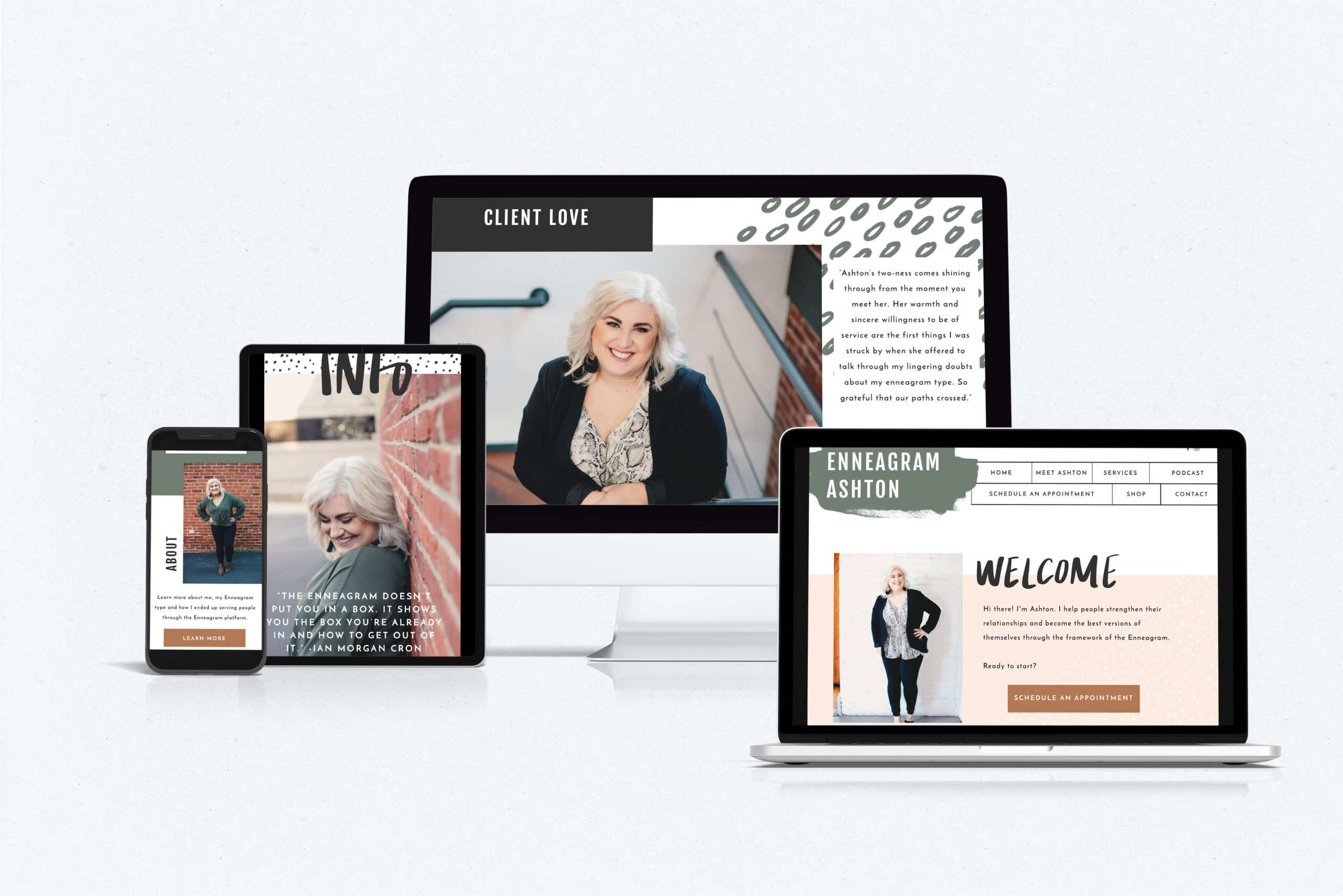
2. Call to Action
One of the biggest mistakes I see on my clients’ sites when they come to me is that they don’t include enough calls to action.
Do NOT leave the guesswork up to your potential clients! Show them the way. Take their hand and escort them from one page of your site to the next. All the way until you get to the contact form!
I suggest having 1-3 calls to action per page.
Types of calls to action:
- Learn More – a button that escorts your prospective client to the next page (services, about page or a FAQ page)
- Join my Community – a pop up or ribbon banner for people to opt-in to your email list (this is HUGE and allows you to then follow up and reconnect with people after they leave your site)
- Let’s Connect – this could go to a social media page or a contact form
It’s so important that you intentionally map out your site and create buttons and copy that shows your visitors where to head next!
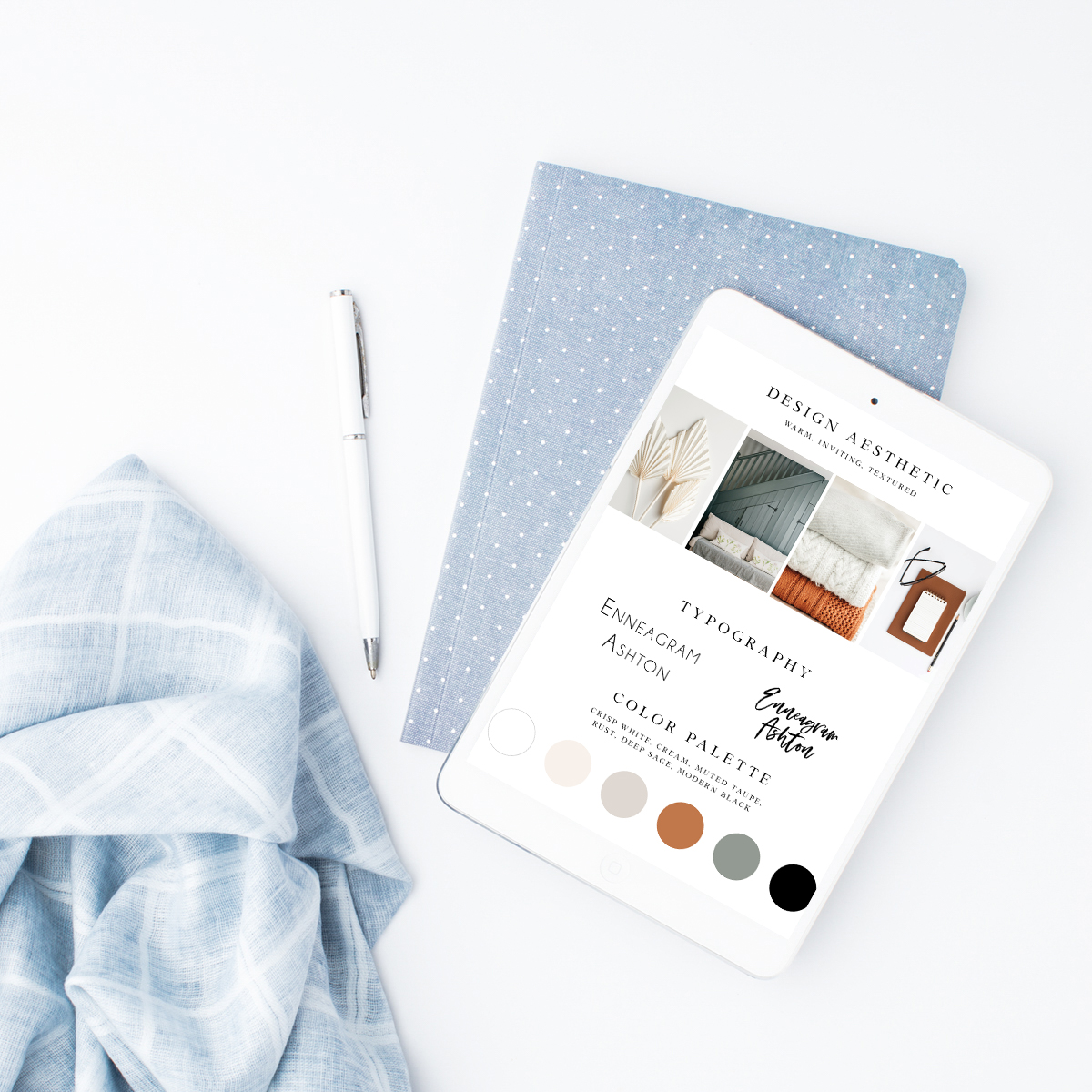
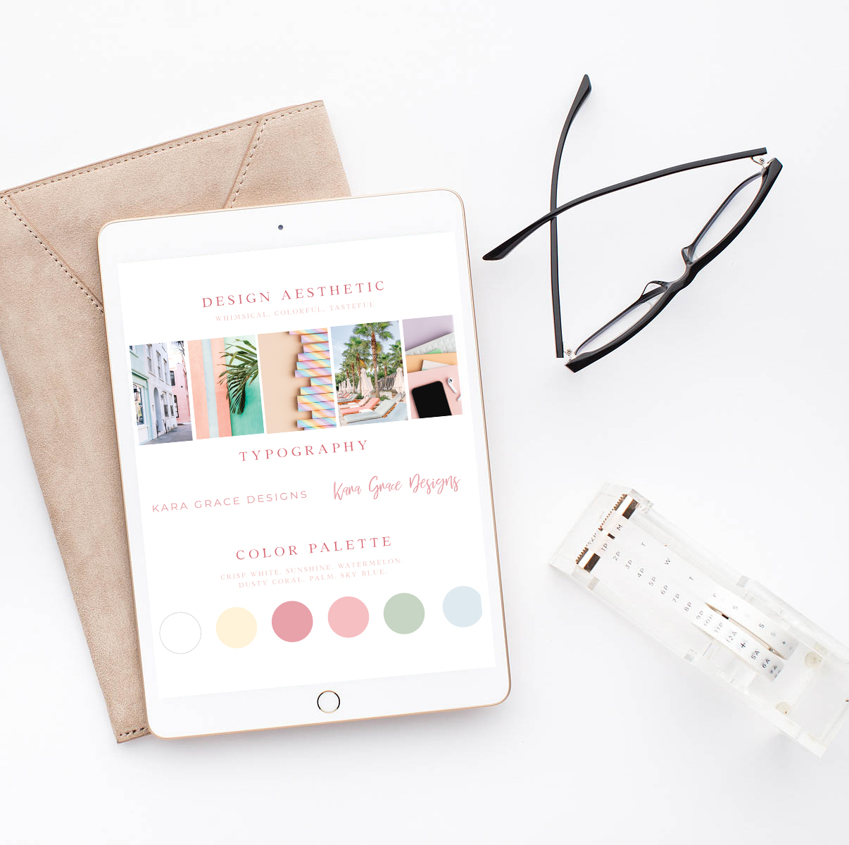
3. Use Colors Intentionally
Before you even get to the stage of building a website, you should have an established color palette. This is sooo important for establishing brand awareness and cohesiveness across all platforms. I have a blog post on my site you can check out to learn more about brand colors and where you can grab some resources to help you keep them organized!
Do not be afraid of white space! Your website should have tasteful uses of color, but you may not want every single page of your site to be splashing with bright, bold colors. Embrace white space and above all, prioritize some good ol’ contrast! Make sure you are using dark colors on light backgrounds and vice versa. Clarity reigns always!
There’s so much I could say about color, but I’ll end with a really quick and easy one. Make all of your call to action buttons STAND OUT! They should be the brightest, boldest color in your brand palette. This attracts people’s attention and is proven to convert better!
My hope is that you learned something new today that you didn’t previously know! Feel free to email me if you have any questions at hello@raiseyourwordsdesign.com.
Have a fabulous week!
Explore More!
Engagements | Weddings | Engagement Session Guides| Wedding Memos| Personal Branding | Adventures


")


